As I’ve dug into my distributed systems research, one question keeps coming up: “How do you visualize distributed systems?” Distributed systems are hard, so it feels like being able to visualize the data flow would go a long way to understanding them in detail and avoiding bugs. Unfortunately, the same things that make architecting distributed systems difficult also make them hard to visualize.
I don’t have an answer to this question, unfortunately. However, in this post I’d like to state my requirements and highlight some visualizations that I think are important. Hopefully this will be the start of a more complete investigation or at least allow others to comment on what they’re doing and whether or not visualization is important.
Static Visualization
A distributed system can loosely be described as multiple instances of a software program running on different machines that react to events. These events can be either external (a user making a request) or internal (handling requests from other instances). The collective individual behavior of each node informs how the entire system behaves.
One high level view of the design of a system looks at the propagation of events, or messages being sent between nodes in the distributed system. This can be visualized using a message sequence chart which embeds the time flow of a system and displays the interaction between nodes as they generate messages in reaction to received messages.
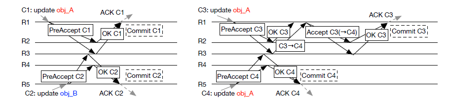
In the message sequence chart, every lane represents a single replica and arrows between them represent message passing and receipt order. Often, crossed arrows represent the difficulty in determining the happens before relationship with respect to message order. These charts are good at defining a single situation and the reaction of the system, but do not do a good job at describing the general interaction. How do we describe a system in terms of the decisions it must make in reaction to received events that might be unordered?
One method of designing a distributed system is to consider the design of only a single instance. Each instance reacts to events (messages) then can update their state or do some work, and generate messages of their own. The receipt and sending of messages defines the collective behavior. This is a simplification of the actor model of distributed computing. This seems like it might make things a bit easier, because now we only have to visualize the behavior of a single instance, and describe message handling as a flow chart of decision making.
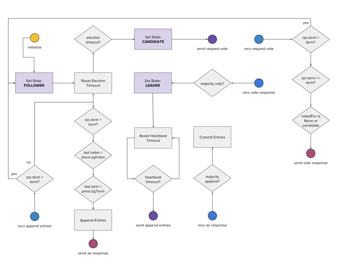
The flow chart above represents one of the attempts I’ve made to describe how the Raft consensus protocol works from the perspective of a single replica server. Raft is generally understood to be one of the most understandable consensus protocols, and as such it should be easy to describe visually. Here, messages are represented as colored circles. Raft has two primary RPC messages: request vote and append entries, therefore the circles represent the send and receive events of both RPC messages and their responses (8 total message types). Each RPC roughly has their own zone in the flow chart. State changes are represented by the purple boxes, decisions by diamonds, and actions by square boxes. As you can see the flow chart is not completely connected, but hopefully by following from a “send” node to a “recv” node, one can track how the system interacts over time as well as individual nodes.
This visualization still needs a lot of help, however. It is complex, and doesn’t necessarily embed all the information of how the complete system handles failure or messages.
Interactive Visualization
The most interesting combination of message traffic and behavior that I’ve seen so far requires JavaScript to create a dynamic, interactive visualization. Here, the user can play with different scenarios to see how the distributed system will react to different events or scenarios. It visualizes both the decision making process of the replica servers, as well as the ordering of messages as they’re sent and received.

One of the first places I encountered this was the RaftScope visualization. Here colored balls with an arrow represent the messages themselves (responses are not filled). The state of each node is shown by the edge color (a timer for followers, dotted for candidates, and solid for leaders). The log of each replica server is also displayed to show how the log repairs itself and commits values.
Moreover, users can also click on nodes and disable them, make “client requests”, pause, or otherwise modify their behavior. This allows custom scenarios to be constructed and interpreted similar to the message sequence diagram, but with more flexibility. The problem is that the entire protocol must be implemented in JavaScript in order to ensure correct visualization (and is therefore a non-trivial, non-development approach to explaining how a system works).
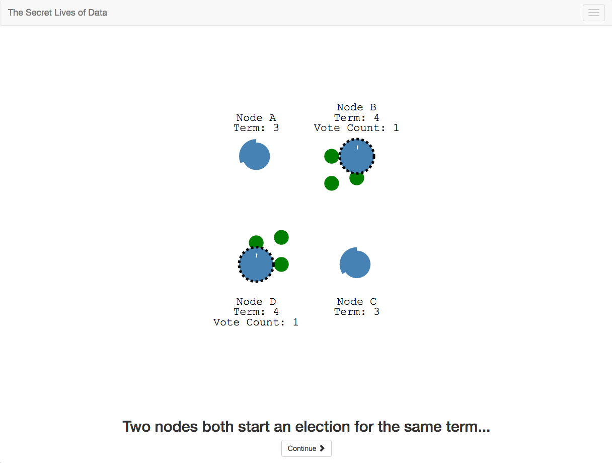
This idea was taken one step further by The Secret Lives of Data, which uses a tutorial style presentation to show in detail each phase of the Raft algorithm. This allows the visualization to show specific scenarios rather than force the user to design them. I hope to see more tutorials for different algorithms soon!
These two examples inspired me to create my own interactive visualization for the work I’m doing on consistency fragmentation. I use a similar design of circles for messages interacting with nodes in a circular topology. Right now it is still unfinished, but I’ve at least put together an MVP of what it might look like.
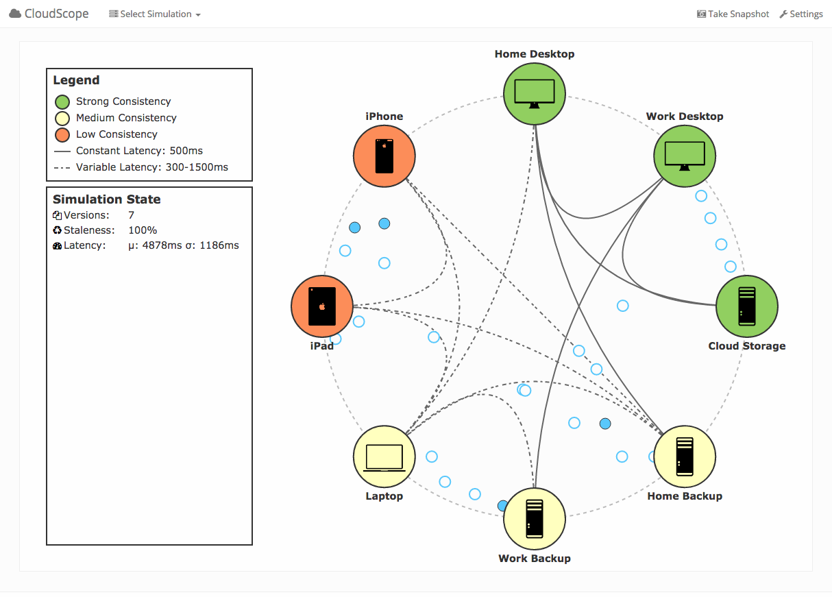
My goal is to feed the visualization actual traces from the backend simulation I’m writing using SimPy or from the logs of live systems. The visualization will be less interactive (in the sense you can’t create specific scenarios) but will hopefully give insight into what is going on in the real system and allow me easier development and architecture.
Conclusion
So I pose to you the following questions:
- Is visualization important to the architecture of distributed systems?
- How can we implement better static and interactive visualizations?
Visualization is not part of my research, but I hope an important part of describing what is happening in the system. Any feedback would be appreciated!