In this quick snippet I present an alternative to the confusion matrix or classification report visualizations in order to judge the efficacy of multi-class classifiers:
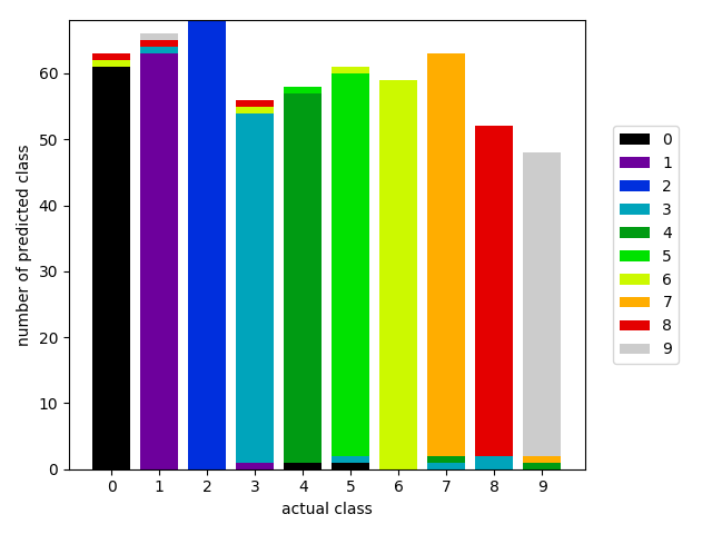
The base of the visualization is a class balance chart, the x-axis is the actual (or true class) and the height of the bar chart is the number of instances that match that class in the dataset. The difference here is that each bar is a stacked chart representing the percentage of the predicted class given the actual value. If the predicted color matches the actual color then the classifier was correct, otherwise it was wrong.
The code to do this follows. This is simple prototype code that we’ll be including in Yellowbrick soon and may not work in all cases; nor does it include features for doing cross-validation and putting together the two vectors required for visualization.
Other interesting things that can be done with this: make the x axis the predicted class instead of the actual class, if classes are ordinal use a heatmap to show predictions over or under the specified class, or find a better way to show “correct” values with out discrete color values. More investigation on this and an implementation in Yellowbrick soon!
Update: Thanks @lwgray for putting together the pull request for this!