This is a follow on to the [prediction distribution]({{ site.base_url }}{% link _posts/2018-02-28-prediction-distribution.md %}) visualization presented in the last post. This visualization shows a bar chart with the number of predicted and number of actual values for each class, e.g. a class balance chart with predicted balance as well.
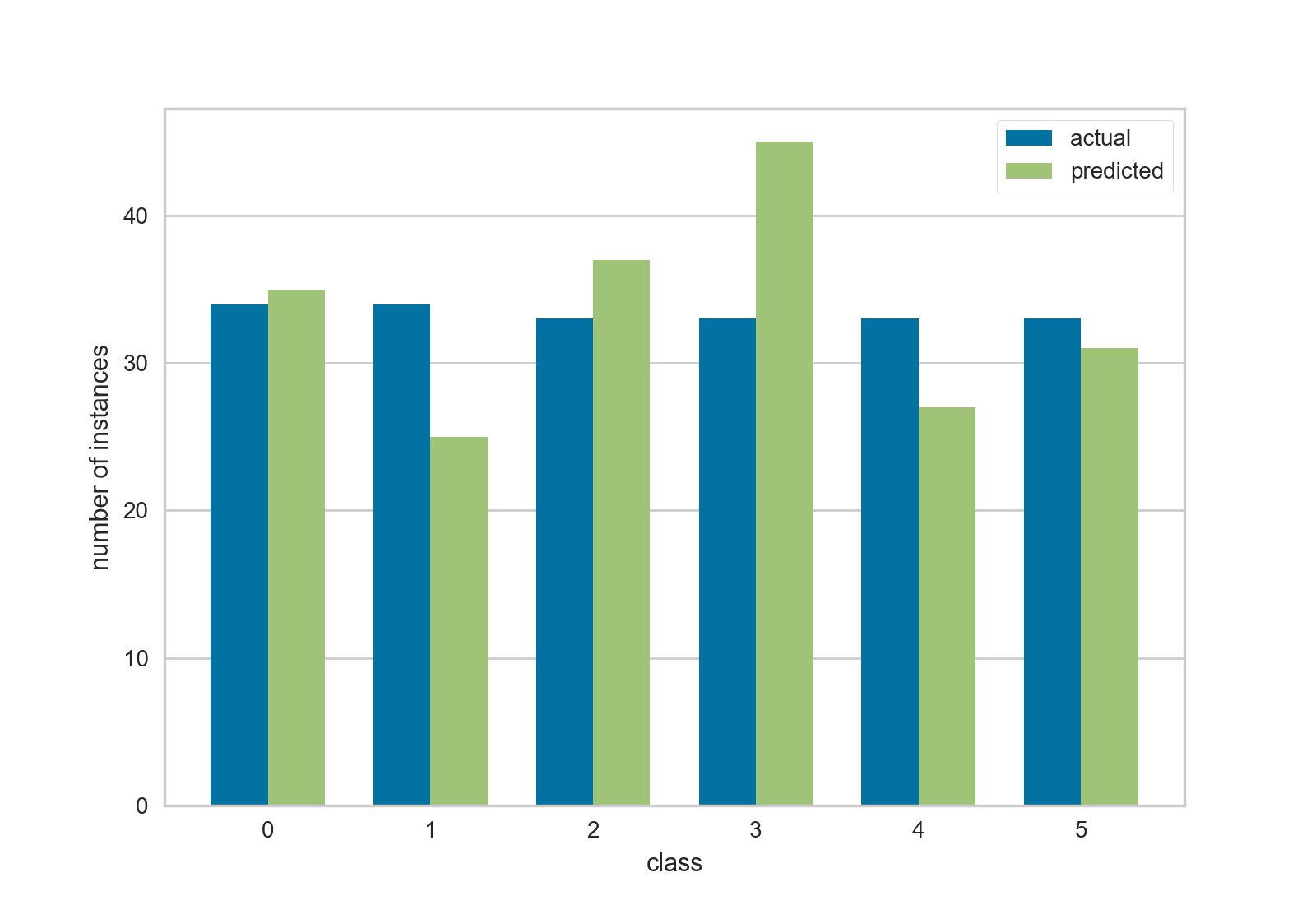
This visualization actually came before the prior visualization, but I was more excited about that one because it showed where error was occurring similar to a classification report or confusion matrix. I’ve recently been using this chart for initial spot checking more however, since it gives me a general feel for how balanced both the class and the classifier is with respect to each other. It has also helped diagnose what is being displayed in the heat map chart of the other post.
The code follows, again prototype code. However in this code I made an effort to use more scikit-learn tooling in the visualization, including their validation and checking code. Hopefully this will help us eliminate problems with various types of input.
This code also shows a cross-validation strategy for getting y_true and y_pred from a classifier. I think this type of code will become a cornerstone in Yellowbrick, so please let us know in the YB issues if you see anything fishy with this methodology!